
Recognizing Canada’s international assistance - Visual identity guidelines
Recognizing Canada’s international assistance
Table of contents
Foreword - A fresh new look to recognize Canada’s international assistance
Each year, Canada’s international assistance partnerships help millions of people in 150 countries and territories. These contributions tell a story, whether they go toward helping to stop the spread of a pandemic, support for refugees, education for women and girls around the world, fighting climate change or improving market access for local businesses.
While Canada has been contributing to international assistance for nearly 75 years, Canadians are not always aware of the how these contributions help build a healthier, safer, more prosperous world. Global Affairs Canada has developed this visual identity to help raise public awareness about the role the Government of Canada plays in international assistance.
This guide explains which visuals to use, and in what circumstances. It is intended for everyone who is involved in Canada’s international assistance – Global Affairs Canada, international assistance partners, and other federal government employees – to recognize Canada’s contributions to international assistance with a simple, clear visual identity, in Canada and abroad.
This guide will help us be more consistent and transparent as we recognize Canada’s investments in international assistance, and show the impact Canada and our partners make around the world.
Read on to learn more about the new look, and how to apply it!
Visual identity for Canada’s international assistance
How do you apply the visual identity in the real world? First, get informed. This guide has all the information you need to apply the visual to your communications products. Second, get creative. Use the visual identity to help you tie your creative content together with a bright, professional, distinctly Canadian style. And third, spread the word! Share your communications products with your target audience here in Canada, and around the world.
The visual identity for Canada’s international assistance provides a common look-and-feel for all international assistance communications materials. It is not a logo with a single standard look. Rather, the visual identity includes the words, the tone and the font, as well as the colours, the graphics, and the imagery. These are visual building blocks that help shape people’s perception and understanding of Canada’s international assistance.
Different elements of the visual identity will be used based on the subject matter, the intended audience, and the communications product. This flexible branding approach helps us maintain the look across different initiatives, products and activities, both online and in print.
Our approach complies with the Federal Identity Program and the Policy on Communications and Federal Identity. Care has been taken to ensure that the graphic elements complement, but do not compete with, the Canada Wordmark as the official symbol of the Government of Canada.
Colour palette
Red, grey, black and white: A classic combination
The visual identity for Canada’s international assistance uses four central colours as a foundational palette that work universally across all applications. The Canada red and the black remain the core colours for the brand to be used in conjunction with the monochromatic palette.
Importance of white
The use of white sets the stage for the visual identity’s colours to pop. Balanced ratios of white space can accentuate the vibrancy of bold colours, or elevate the sophistication of the monochromatic palette.
Note about colour distinctions
Please use these colour percentages as well as the design applications in order to ensure proper usage:
Pantone 485C
- Print - 0C 97M 100Y 0K
- Digital - 238R 50G 36B
- HTML (digital) - #ED2327
BLACK PMS Process Pantone 187C
- Print - 0C 0M 0Y 100K
- Print - 23C 100M 88Y 16K
- Digital - 0R 0G 100B
- Digital - 169R 30G 45B
- Digital - #000000
- HTML (digital) - A91E2D
Pantone 445C
- Print - 52C 23M 30Y 74K
- Digital - 45R 66G 69B
- HTML (digital) - 2D4245
Typography
The visual identity for Canada’s international assistance uses Noir Pro as the primary font.
Noir Pro
Noir Pro is a sans serif font family of 12 fonts with contemporary aesthetics heavily influenced by early 20th century geometric typefaces. While having its geometric structure, it has an organic personality with touch of warmth injected to each form.
The majority of communications products about Canada’s international assistance should be set to Noir Pro regular with the medium weight serving as heads, subheads or in creative typographic applications. Use the semibold weight to call out important words or information within the copy.
Arial
For those who do not have access to Noir Pro, the font should be set to Arial regular. Use the bold weight to call out important words or information within the copy.
Photography, videography and images
The visual identity for Canada’s international assistance will often be paired with photos, images, and video footage to help demonstrate the impact of Canada’s international development and humanitarian aid projects.
When sourcing images or creating content, please ensure that all participants have given their informed consent to be photographed or filmed. Take care to ensure that the content is used with the permission of photographers, illustrators or graphic artists, and that they are credited appropriately.
Look for images that portray all people in a dignified and respectful manner. When possible, feature people actively participating in programs or activities. Be careful not to perpetuate harmful stereotypes, and work to find images that are hopeful and results-focused whenever possible.
Requirements for Canada’s international assistance partners
Our international assistance partners – including civil society organizations and multilateral partners – do essential work in partner countries, and are central voices in raising awareness about the importance of international assistance, and the impact of Canada’s contributions.
Canada’s role as a global player in international assistance must be effectively acknowledged in our partners’ communications products. Public acknowledgment of Canada’s contribution is a condition of accepting grants and contributions.
Read on for more detailed requirements for how partners must use the visual identity to acknowledge Canada’s investments in their initiatives.
Graphic elements for partners
This version of the visual identity for Canada’s international assistance has been developed especially for our partners. It features the Canada Wordmark, the stylized maple leaf, and a standard credit line that acknowledges Canada’s partnership.
These graphic elements work together to create consistency across all communications materials, yet also acknowledges a clear distinction between the work of the Government of Canada, and the work of civil society and multilateral organizations. We are proud to work with you, and this version of the visual identity keeps our partnership front-and-centre. It also functions as a built-in credit line.

Co-branding
The visual identity for Canada’s international assistance will often appear alongside the logos of our partners or other donors.
In co-branding instances, the visual identity for Canada’s international assistance must receive the same prominence and proportion as the identifiers of other funding parties who have made a similar contribution. If Canada is the major donor, our visual identity must be the most prominent one. For example, it must be placed first or above other identifiers, and should be larger if the design warrants it.

Clear space and minimum size
Our visual identity works best when it has space to stand out. Please take care not to place the visual identity for Canada’s international assistance on busy backgrounds with lots of text and images.
The minimum recommended clearance around the visual identity’s edges is approximately the height of the “C” in the Canada Wordmark.
Clear space
Make sure that you observe the clear space around the signature to maximize visual effectiveness.

Minimum size
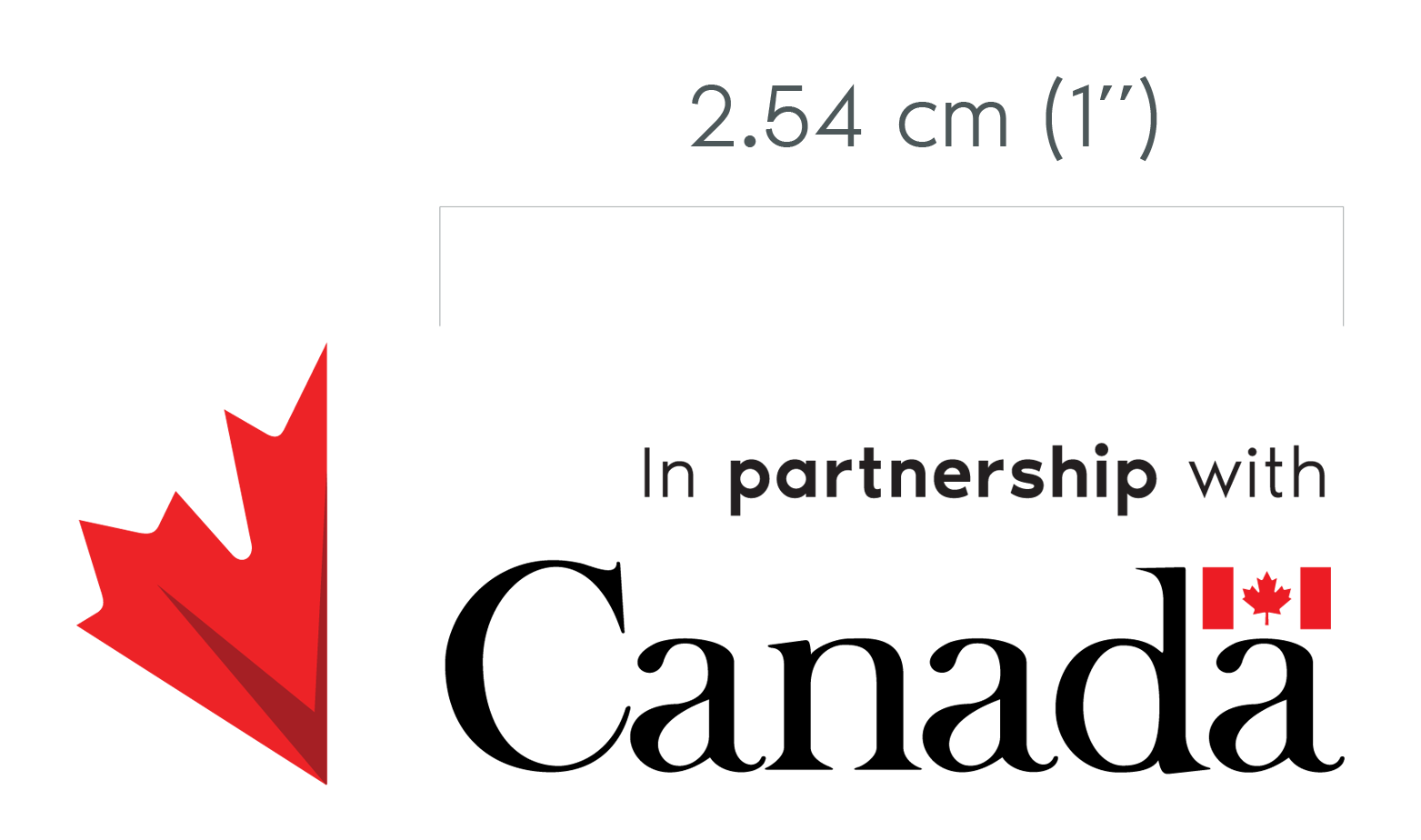
To ensure legibility of the descriptor do not use the Canada Wordmark smaller than 2.54 cm (1”) wide.
Visual identity for partners “don’t”
Alterations
The visual identity for Canada’s international assistance is a valuable asset. Never attach other unapproved nomenclature or graphics to the visual identity, or change the graphic in any way.
- Don’t rotate the graphic elements
- Don’t place the graphic elements inside of a box unless specified
- Don’t add a drop shadow to the graphic elements
- Don’t change the size of the graphic elements
- Don’t change the order or the directions of the graphic elements
- Don’t stretch the graphic elements horizontally or vertically
- Don’t outline the letters
Apply the visual identity
The visual identity is available in several formats to provide partners with the ability to acknowledge Canada’s contributions on a variety of communications products and program materials.
Examples of where partners must use the visual identity include, but are not limited to:
- Newsletters
- Press releases
- Reports
- Videos
- Websites and mobile applications related to funded activities
- Electronic presentations and presentation materials
- Print products such as brochures and posters
- Event or conference materials, such as invitations, banners, backdrops, roll-ups or virtual event backgrounds
- Signs or plaques
- Infrastructure, such as wells, pumps, buildings, and bridges
- Shipping materials
- Goods, such as tents, blankets, and jerry cans if appropriate
- Packaging for small products, such as mosquito nets, grain sacs, hygiene kits, and school supplies
- Staff clothing, but only where relevant to successful project delivery, such as uniforms for community outreach staff
Where the visual identity should not be used
While consistent use of the visual identity on communications products is encouraged, it does not belong on everything. The visual identity should never be used on the following materials:
- Stationery used by implementing partners
- Business cards of staff not directly employed by Global Affairs Canada
- An organization’s own office signage and office equipment, including computers
- Vehicles not exclusively used for delivering Canada-funded projects
- Small, personal goods such as toothbrushes or razors
- School books or bags
- Clothing for beneficiaries
- Program assets for which the final delivery organization is a partner government (for example, with multilateral development banks)
When acknowledging funding, implementing partners must always consider the safety, security and dignity of beneficiaries and staff. An exception to public acknowledgment of a program may be approved where it may:
- impact individual or organisational human dignity (for example, personal goods, individuals’ homes and businesses)
- endanger the lives, safety or security of beneficiaries and staff, or threaten the safe and effective delivery of the project or humanitarian assistance
- obstruct humanitarian operations, including delaying the delivery of urgent humanitarian assistance
- undermine the independence or credibility of the program or organization
Text credits
Where space and circumstances do not allow for the full visual identity to be used, one of the following text credit lines may be used:
- In partnership with the Government of Canada
- En partenariat avec le gouvernement du Canada
- Funded [in part] by the Government of Canada
- Financé [en partie] par le gouvernement du Canada
Requirements for Global Affairs Canada
Global Affairs Canada will use the visual identity as standard common look-and-feel across all international assistance communications and program materials. All Global Affairs Canada employees and contractors who work on the international assistance portfolio, in Canada and at missions abroad, are expected to familiarize themselves with the new visual identity and use it whenever they are representing the department. Employees are also expected to be able to give advice to partners about the visual identity, and direct them to the right resources for more information as needed.
The use of a consistent style is essential to help us present a more unified, recognizable identity to all audiences, in Canada and abroad. It’s about more than a new look: it’s about communicating more clearly and transparently about the investments Canada makes in international assistance, and the partners we work with around the world.
The visual identity provides us with a shared starting point, but it does not mean there is no room for creativity! The messages and the images used, as well as the style and types of communications products created, will be varied and designed to fit the purpose of the message and the intended audience.
Graphic elements for Global Affairs Canada
All Global Affairs Canada communications products will include the core graphic elements of the maple leaf and the Canada Wordmark. Titles and messages will be specific to the initiatives being promoted and will be styled using the standard font and colour palettes.

Clear space and proportions
The Canada Wordmark may not be altered in any way. It is displayed prominently, in generous open space, free from close association with any interfering or distracting elements. It may not appear on a visually conflicting background. The Canada Wordmark and the half leaf are displayed as two distinct elements.
Protection zone
The protection zone is an area extending for a distance equal to the height of the "C", to the right, above and below, and twice that measurement to the left of the Canada Wordmark. The background of the protection zone is a single solid colour.
Federal Identity Program
It is important to note that the visual identity for Canada’s international assistance must be used in addition to departmental or government signature as well as the Canada Wordmark, in accordance with the Federal Identity Program.
Apply the visual identity
Global Affairs Canada employees who work on the development portfolio are required to use the visual identity for Canada’s international assistance on all communications products, including but not limited to:
- Social media graphics
- Infographics
- GIFs
- Digital call backdrops
- Newsletters, press releases, reports
- Videos
- Websites and applications related to funded activities
- Electronic presentations and related materials
- Print materials, such as brochures, posters, and reports
- Conference and event materials, such as banners, backdrops, and roll-ups
- Shipping materials
- Staff clothing, but only where relevant to successful project delivery, such as uniforms for community outreach staff
Contact us
For more guidance on recognizing Canada’s international assistance, please contact Global Affairs Canada at visibility-visibilite@international.gc.ca.
Related information
- Date modified: